Note
Go to the end to download the full example code.
Using ShaRP to explain feature importance across a population
This example shows how sharp can be used to explain feature importance across a
population. We will focus on analysing aggregate feature importance across the
different strata of a ranking problem.
Each stratum is defined by a range (using percentiles) of a ranking problem. For each stratum, we will be able to understand which features have the highest impact (positive or negative) in each group’s ranking.
In this example, we will work with a sample of an ACS Income dataset.
import numpy as np
import matplotlib.pyplot as plt
from sklearn.datasets import fetch_openml
from sklearn.preprocessing import MinMaxScaler

from sharp import ShaRP
from sharp.utils import check_inputs

# This will help make our visualizations look beautiful :)
plt.style.use("seaborn-v0_8-whitegrid")
Let’s start with data preparation. For this example, we chose The ACSIncome dataset which is one of five datasets created by Ding et al. as an improved alternative to the popular UCI Adult dataset. Data is provided for all 50 states and Puerto Rico. Its initial purpose was to predict whether US working adults’ yearly income is above $50,000. The features are the following: - AGEP: age - COW: class of worker - SCHL: educational attainment - MAR: marital status - OCCP: occupation - POBP: place of birth - RELP: relationship - WKHP: usual hours worked per week - SEX: sex - RAC1P: recoded detailed race code
X, y = fetch_openml(
    data_id=43141, parser="auto", return_X_y=True, read_csv_kwargs={"nrows": 150}
)
Change data types of categorical features and reduce the number of features in the dataset
numerical_cols = ["AGEP", "WKHP"]
ordinal_cols = ["SCHL"]

X = X.filter(items=numerical_cols + ordinal_cols)

X.describe()
We can also take a quick look at a few rows of our dataset:
X.head()
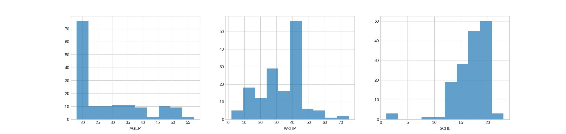
Checking the distributions of the features may also help us better understand the results for feature importance later on:
fig, axes = plt.subplots(1, 3, figsize=(19, 4.5))

for ax, col in zip(axes, X.columns):
    ax.hist(X[col], alpha=0.7, bins=10)
    ax.set_xlabel(col)

plt.show()
Suppose that a bank wants to rank individuals in this dataset who are are potentially high-earning to send them information about a loan opportunity. A team at the bank comes up with the following scoring function:
$$ Score = 20% ~cdot ~AGEP ~+ ~30%~cdot~WKHP ~+ ~50%~cdot~SCHL $$
A score is computed for each individual in the bank’s customer database, individuals are ranked on their score from higher to lower, and flyers to apply for the loan are sent to the best-ranked (i.e., highest-scoring) 50 individuals (the top-50).
Note: When building a ranker like this, it is often important to _standardize_ features. For example, if one of these features were income last year and the mode value was $50,000, it would orders of magnitude larger than the other features. Consider the ranker that was $Score = 10% ~cdot$ income last year $+ 90% ~cdot$ SCHL, all of $Score$ would be from income last year. We will do this below.
We’ll define the scoring function and calculate the scores of all individuals:
def score_function(X):
    X, _ = check_inputs(X)
    # AGEP, WKHP, SCHL
    return 0.2 * X[:, 0] + 0.3 * X[:, 1] + 0.5 * X[:, 2]


# Standardize X and calculate scores
scaler = MinMaxScaler()
X.iloc[:, :] = scaler.fit_transform(X)
y = score_function(X)
We can now set up our ShaRP object and calculate feature contributions across all individuals:
xai = ShaRP(
    qoi="rank",
    target_function=score_function,
    measure="shapley",
    sample_size=None,
    replace=False,
    random_state=42,
    n_jobs=-1,
)

xai.fit(X)

contributions = xai.all(X)
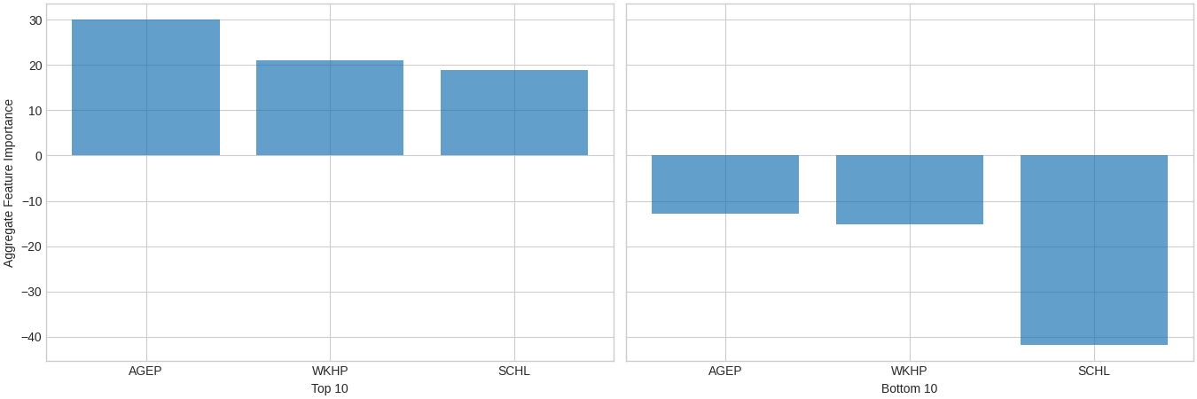
Let’s compare the aggregate feature contributions of the top-10 vs bottom-10 individuals, in terms of ranking:
# Indices for the 10 lowest-ranked individuals
bottom_idx = np.argpartition(y, 10)[:10]

# Indices for the 10 highest-ranked individuals
top_idx = np.argpartition(y, -10)[-10:]

# Set up the visualization
fig, axes = plt.subplots(1, 2, figsize=(13.5, 4.5), layout="constrained", sharey=True)
xai.plot.bar(contributions[top_idx].mean(0), ax=axes[0], alpha=0.7)
axes[0].set_xlabel("Top 10")
axes[0].set_ylabel("Aggregate Feature Importance")
xai.plot.bar(contributions[bottom_idx].mean(0), ax=axes[1], alpha=0.7)
axes[1].set_xlabel("Bottom 10")
axes[1].set_ylabel("")

plt.show()
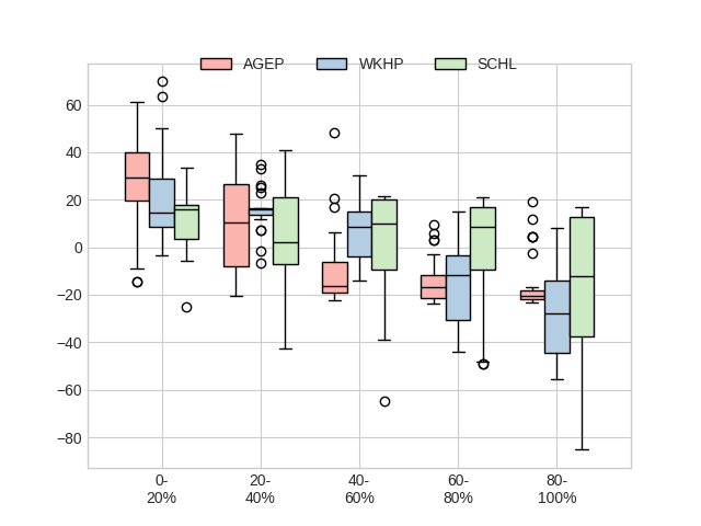
We can also get a sense on how feature importance varies across strata:
xai.plot.box(X, y, contributions, group=5, cmap="Pastel1")
plt.show()
Total running time of the script: (1 minutes 9.958 seconds)