Note
Go to the end to download the full example code.
Comparison of feature contributions for advantaged and disadvantaged groups
This example demonstrates how feature contributions differ for advantaged and
disadvantaged groups after training ShaRP model on the whole data.
import matplotlib.pyplot as plt
from sklearn.datasets import fetch_openml
from sklearn.preprocessing import MinMaxScaler

from sharp import ShaRP
from sharp.utils import check_inputs

plt.style.use("seaborn-v0_8-whitegrid")
Let’s start with data preparation. For this example, we chose The ACSIncome dataset which is one of five datasets created by Ding et al. as an improved alternative to the popular UCI Adult dataset. Data is provided for all 50 states and Puerto Rico. Its initial purpose was to predict whether US working adults’ yearly income is above $50,000. The features are the following: - AGEP: age - COW: class of worker - SCHL: educational attainment - MAR: marital status - OCCP: occupation - POBP: place of birth - RELP: relationship - WKHP: usual hours worked per week - SEX: sex - RAC1P: recoded detailed race code
X, y = fetch_openml(
    data_id=43141, parser="auto", return_X_y=True, read_csv_kwargs={"nrows": 150}
)

# Get the indices of samples that belong to each group.
# We will use SEX as sensitive attribute
adv_idx = X[X["SEX"] == 1].index
dis_idx = X[X["SEX"] == 2].index

# Reduce the number of features in the dataset
numerical_cols = ["AGEP", "WKHP"]
ordinal_cols = ["SCHL"]

X = X.filter(items=numerical_cols + ordinal_cols)

X.head()


# Here we will define the scoring function
def score_function(X):
    X, _ = check_inputs(X)
    return 0.2 * X[:, 0] + 0.3 * X[:, 1] + 0.5 * X[:, 2]


# Standardize X and calculate scores
scaler = MinMaxScaler()
X.iloc[:, :] = scaler.fit_transform(X)
scores = score_function(X)
Next, we will configure ShaRP and fit it on the whole dataset:
xai = ShaRP(
    qoi="rank",
    target_function=score_function,
    measure="shapley",
    sample_size=None,
    replace=False,
    random_state=42,
    n_jobs=-1,
)

xai.fit(X)
Let’s compute contributions for the whole dataset
contributions = xai.all(X)

# Now let's create box plots and compare feature contributions for privileged and
# protected groups

fig, axes = plt.subplots(1, 3, sharey=True, figsize=(15, 5))

for ax, idx, title in zip(
    axes.flatten(),
    [X.index, adv_idx, dis_idx],
    ["All", "Advantaged group", "Disadvantaged group"],
):
    xai.plot.box(X=X.loc[idx], y=scores[idx], contributions=contributions[idx], ax=ax)
    ax.set_xlabel(title)

plt.show()

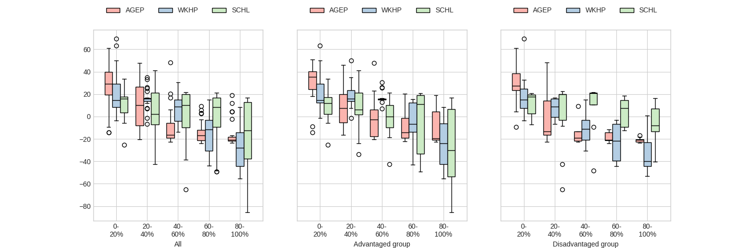
On the plots, feature contributions are shown across different strata, e.g., for top-20% of ranked individuals, for the whole dataset (i.e., All), and both advantaged and disadvantaged groups. For the advantaged group, age (AGEP) exhibits stable importance across all strata, while the contributions of worked hours (WKHP) and educational attainment (SCHL) increase as we move toward lower-ranked individuals. Conversely, for the disadvantaged group, the importance of AGEP decreases with lower ranks, while WKHP and SCHL remain relatively stable.
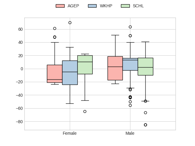
We can also compare contributions across groups overall:
X["Sex"] = ""
X.loc[adv_idx, "Sex"] = "Male"
X.loc[dis_idx, "Sex"] = "Female"
xai.plot.box(X, scores, contributions, group="Sex")
plt.show()

# We can see that for males, the importance of `WKHP` is lower compared to females, while
# `AGEP` shows also a positive contribution to the outcomes, indicating that older
# individuals are more likely to achieve favorable results.

Total running time of the script: (0 minutes 59.944 seconds)